A few weeks ago, Erica Campbell posted about her performance at Howard’s 2015 Homecoming. Although her star power was alluring, in that moment, it was the creative direction and event branding I observed that pulled me into the “glory” of homecoming season.
Distinction: Glory Theme & Concept
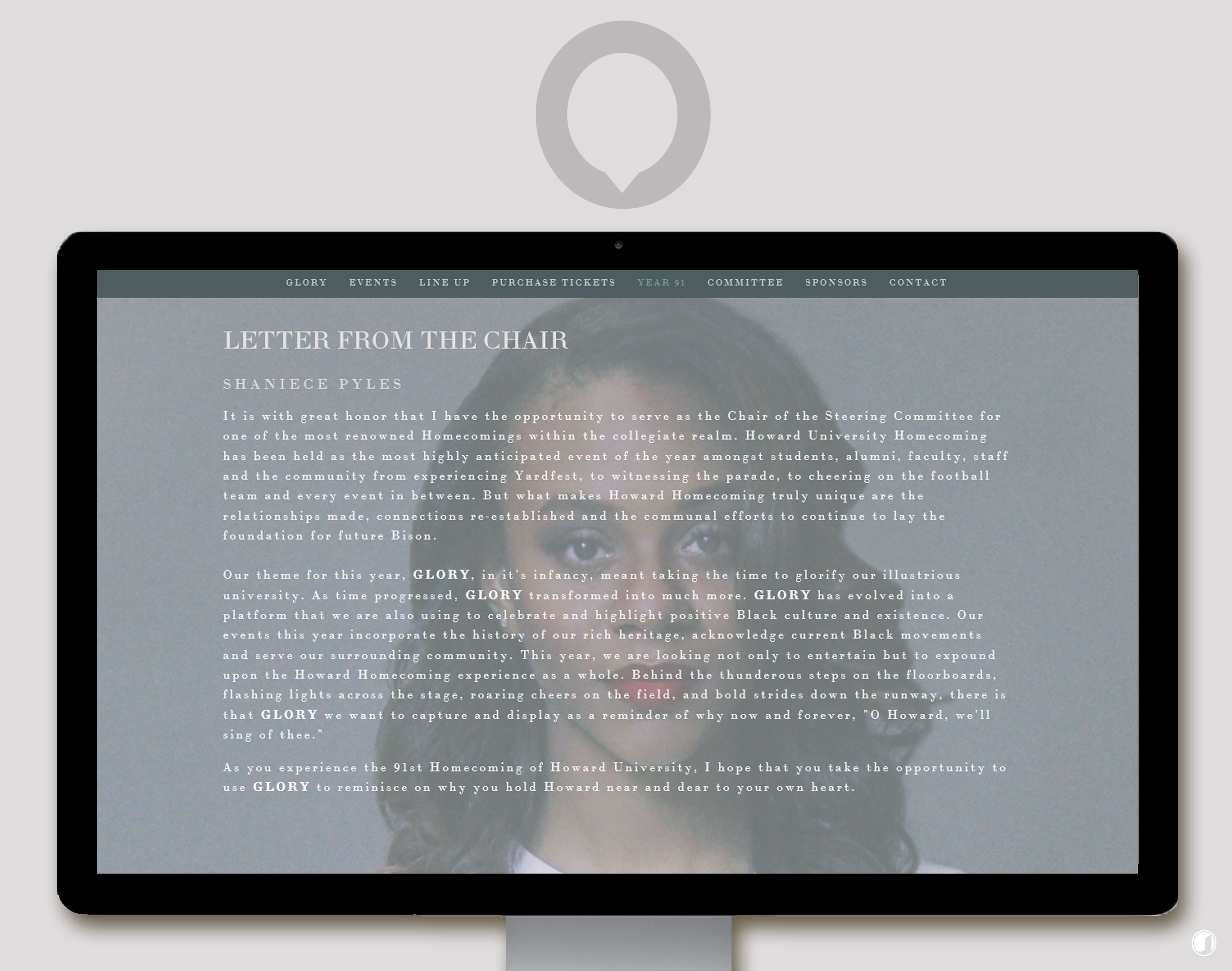
When organizing an event, an entity must focus on curating hype and curating an experience worth the hype. Howard University successfully curated a hype hinged on the meaningful theme of “Glory.” There’s power and distinction when an entity is able to hinge an entire movement on one word. ShaNiece Pyles, Homecoming Chair, expressed on Howard’s Year 91, that Glory represented, “a platform that we are also using to celebrate and highlight positive Black culture and existence. Our events this year incorporate the history of our rich heritage, acknowledge current Black movements and serve our surrounding community.”
Curating a theme and creative narrative with personal significance is key to developing something you’re proud of and something that’s #donegrayt. “Glory” forges a narrative that touches the heart of current Howard students; in addition, a creative narrative that moves the hearts of those who have been influenced by Howard University and its alumni.
Creativity: Design & Creative Direction
Assembling an image to a “hype” is an integral aspect of creating an experience that sustains its revolving hype. The 2015 “Glory” Howard Homecoming design and creative direction leveraged simplicity, crispness, and an element of professionalism that established the 2015 Howard Homecoming as a formidable brand. Fred Sands and Khalid Briggs, functioned as the creative directors for the 2015 Howard “Glory” Homecoming.
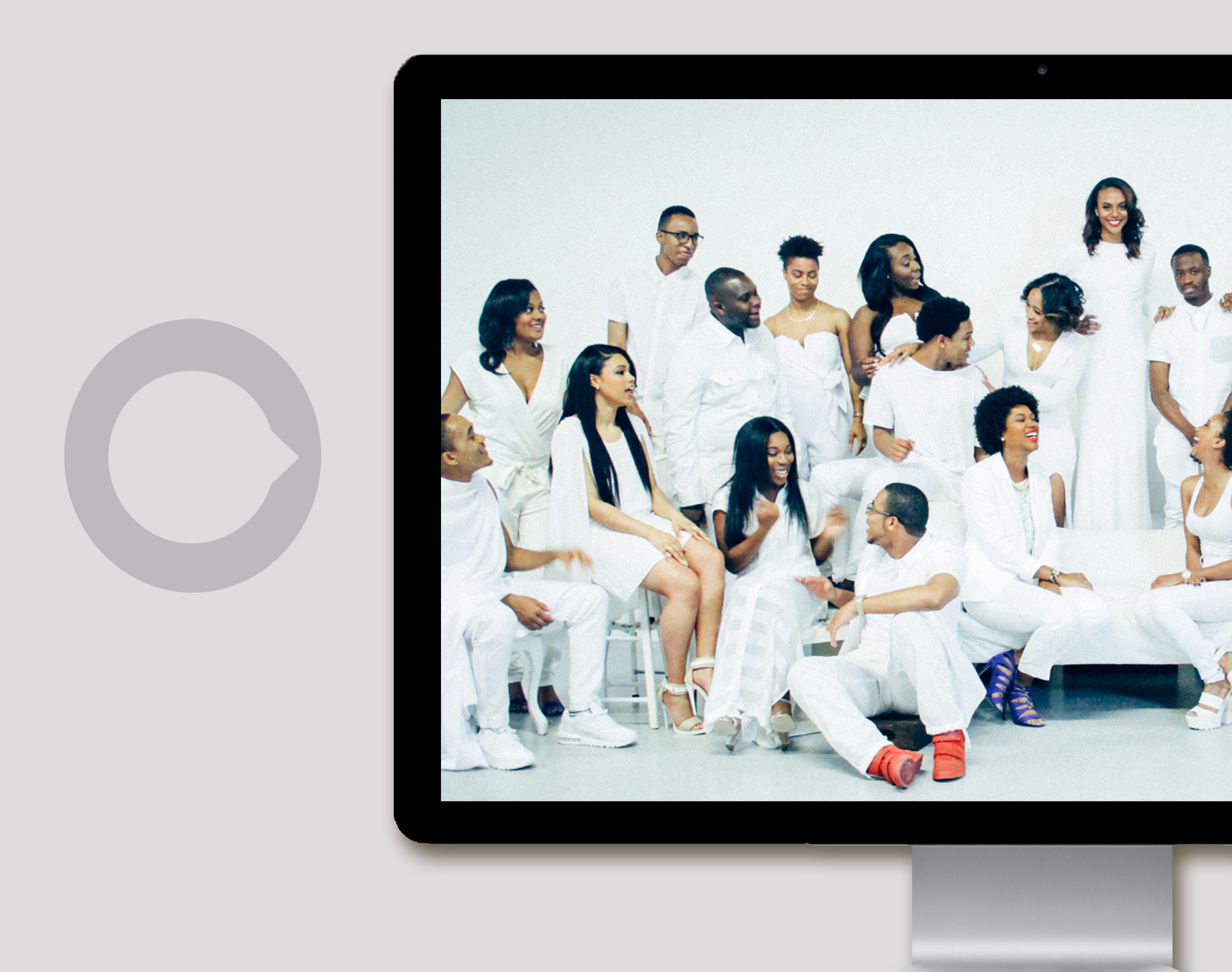
The key to creating distinctive brand imaging is to enter the design process from a different angle & different level than where a particular entity functions. Integrate elements that elevate your brand awhile maintaining authenticity.

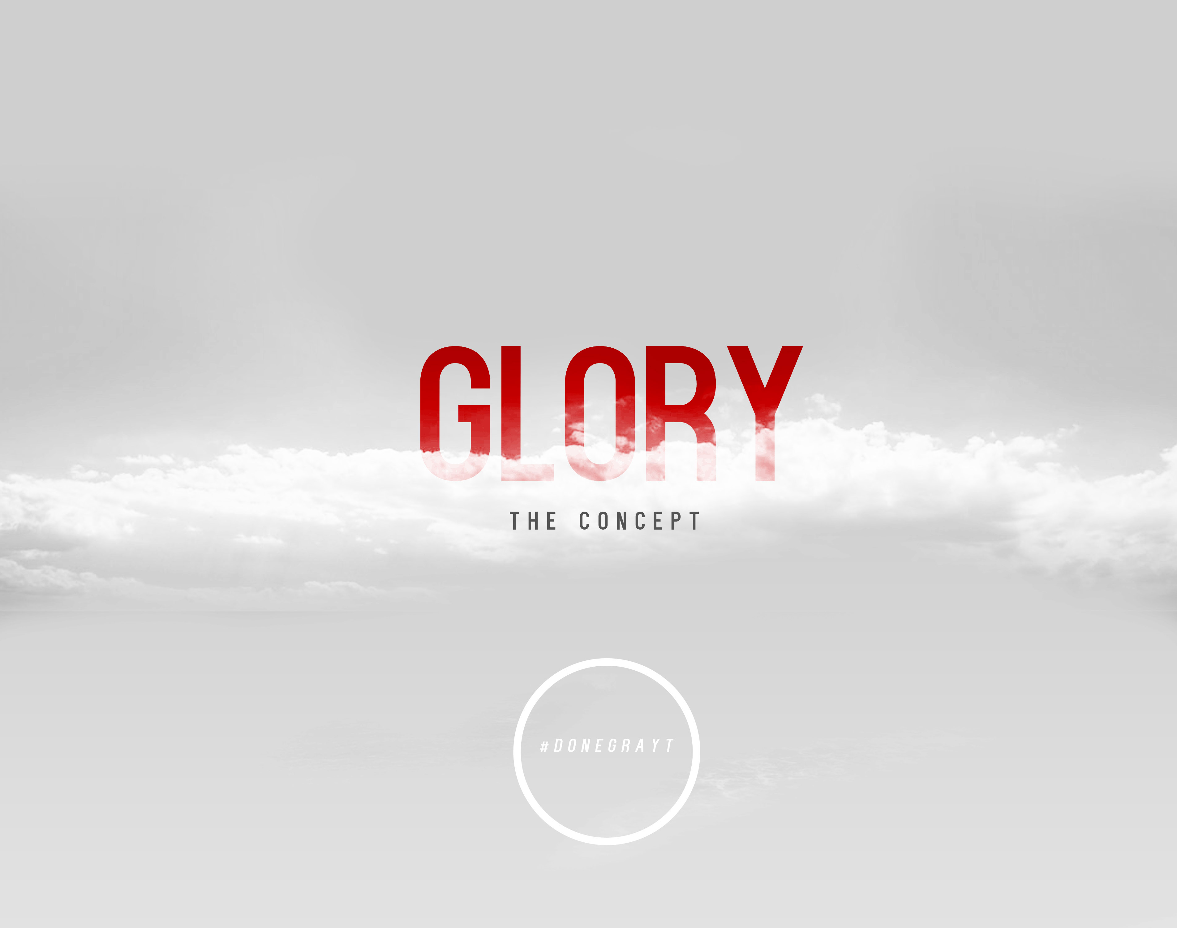
Sands & Briggs implemented a design narrative using desaturated clouds pierced with muted, yet powerful reds. Authentically, “Glory” conveyed the aspiration of merging Howard’s historical glory with modern day reverence, appreciation, and confidence.

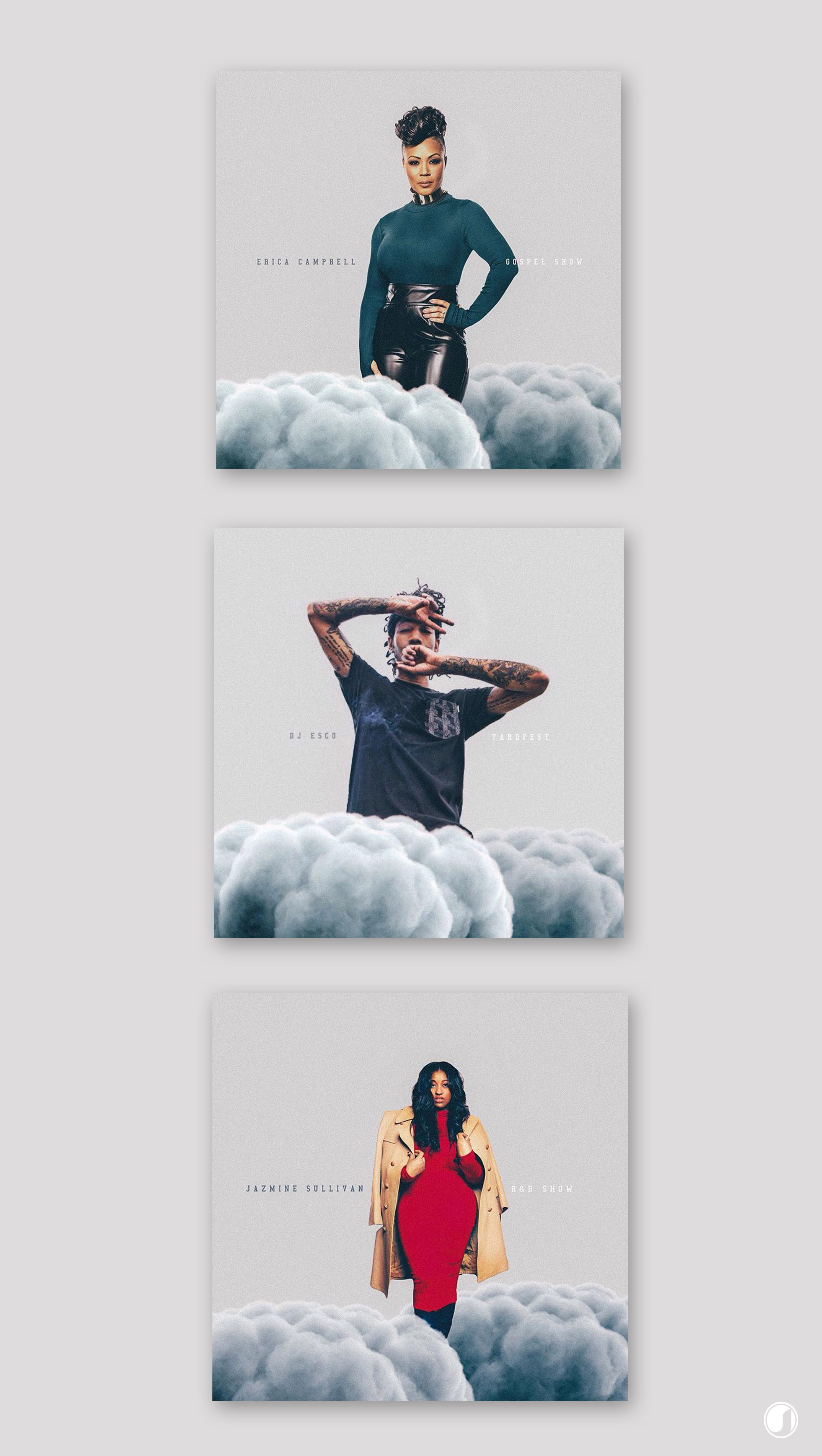
As my favorite release from their Glory promotional rollout, Sands and Briggs announced the artists who were scheduled to appear at their Homecoming events–with simplicity and efficiency (pictured below). Using figures, Glory’s reoccurring cloud motif, and muted background text placement, their artist rollout captures the eye and informatively promotes with muted imagery.
Connectivity: Social Media & Online Presence
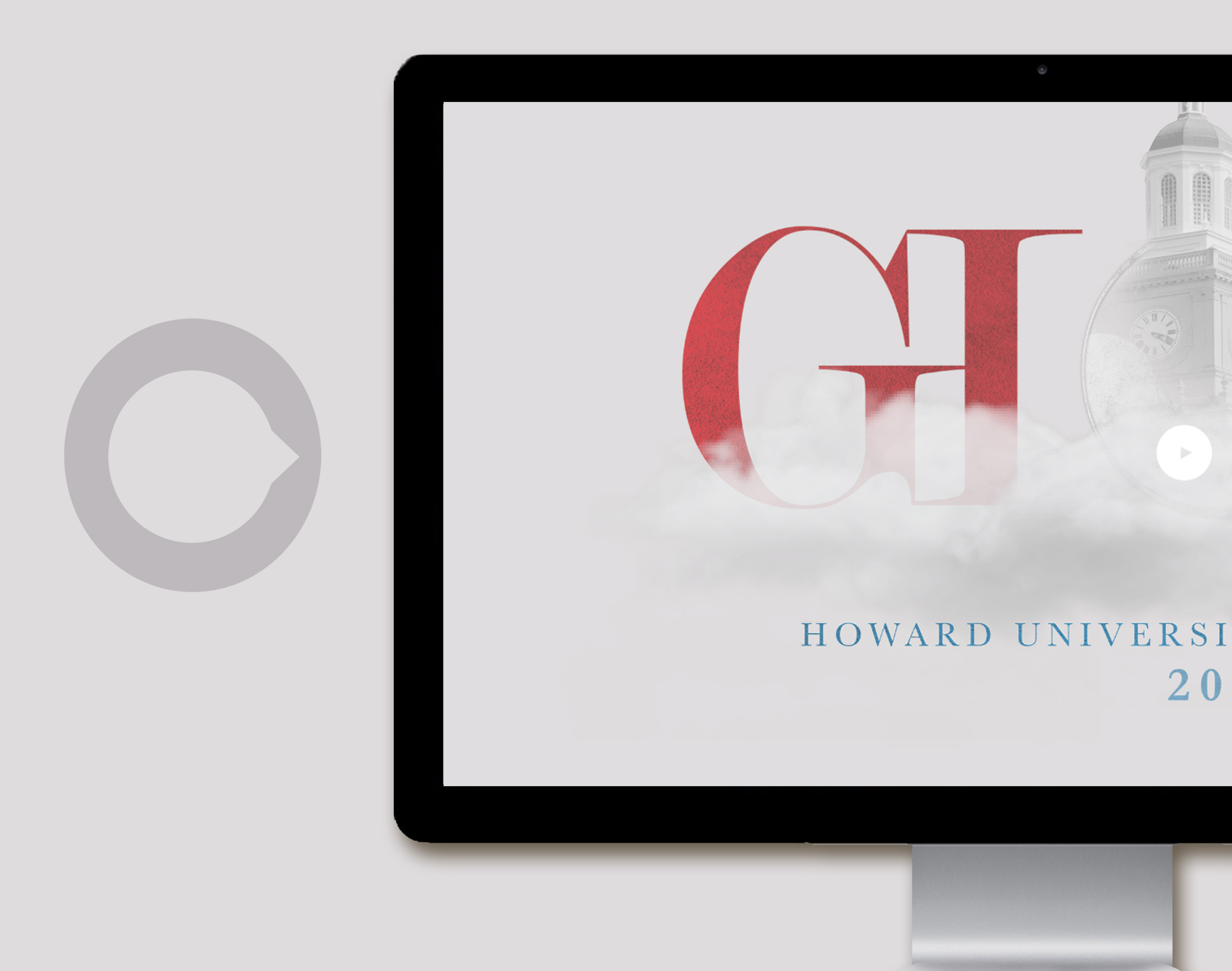
Third, connecting people to the hype of an experience is equally important as curating the hype and imaging the hype. Representing the medium, in which I discovered their homecoming, Howard’s “Glory” online presence exuded dedication, consistency, and precision. Deigned through Squarespace, Howard’s “Bison Homecoming” website provided a wealth of information regarding the events, the celebrity guests, the Homecoming committee, and the inspiration behind the homecoming.
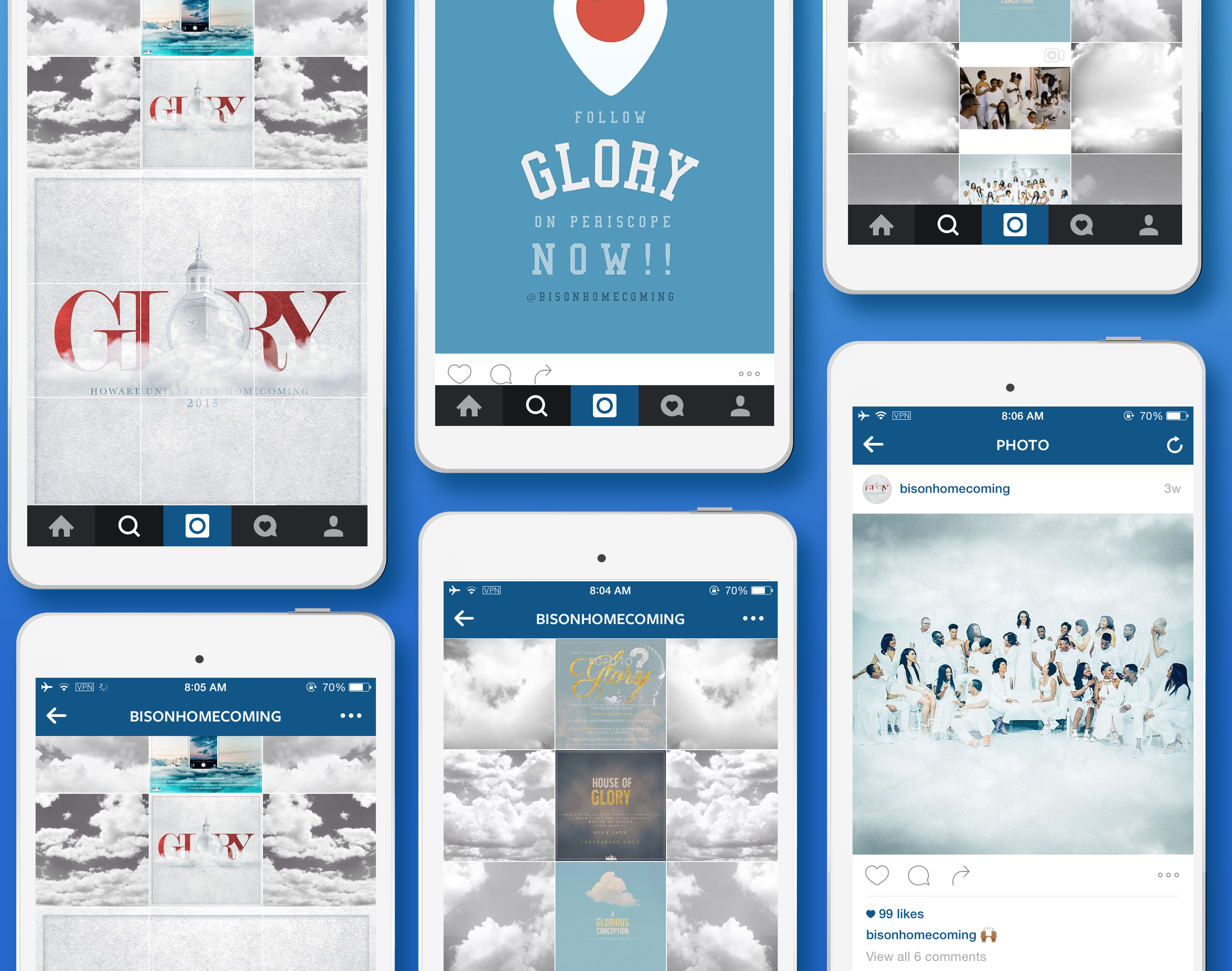
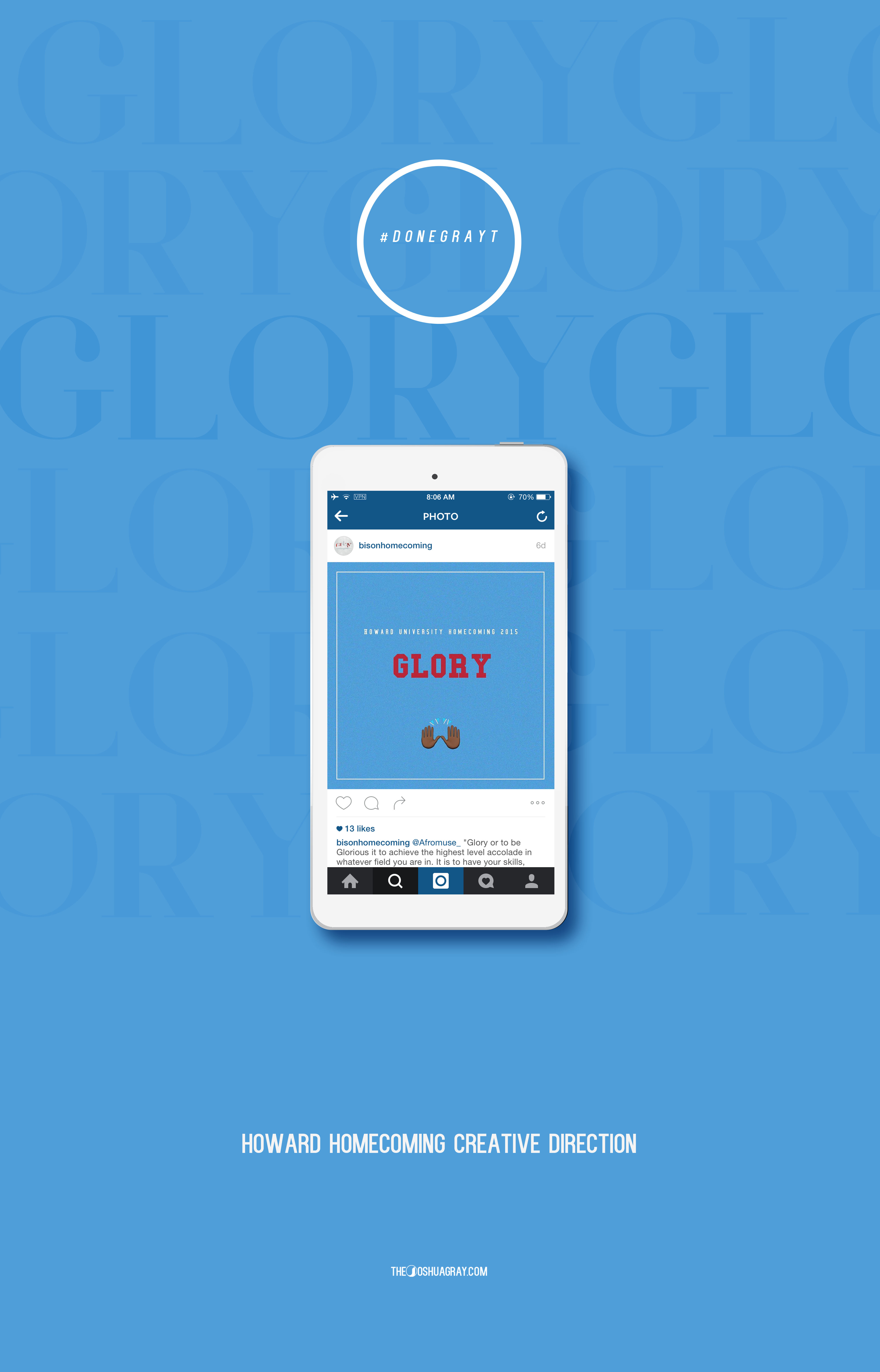
Their Instagram @bisonhomecoming affirmed my assertion that this was a campaign #DoneGrayt. The connectivity to the events, the artistic motifs and visuals, and updates all converged to create their Instsgram presence.
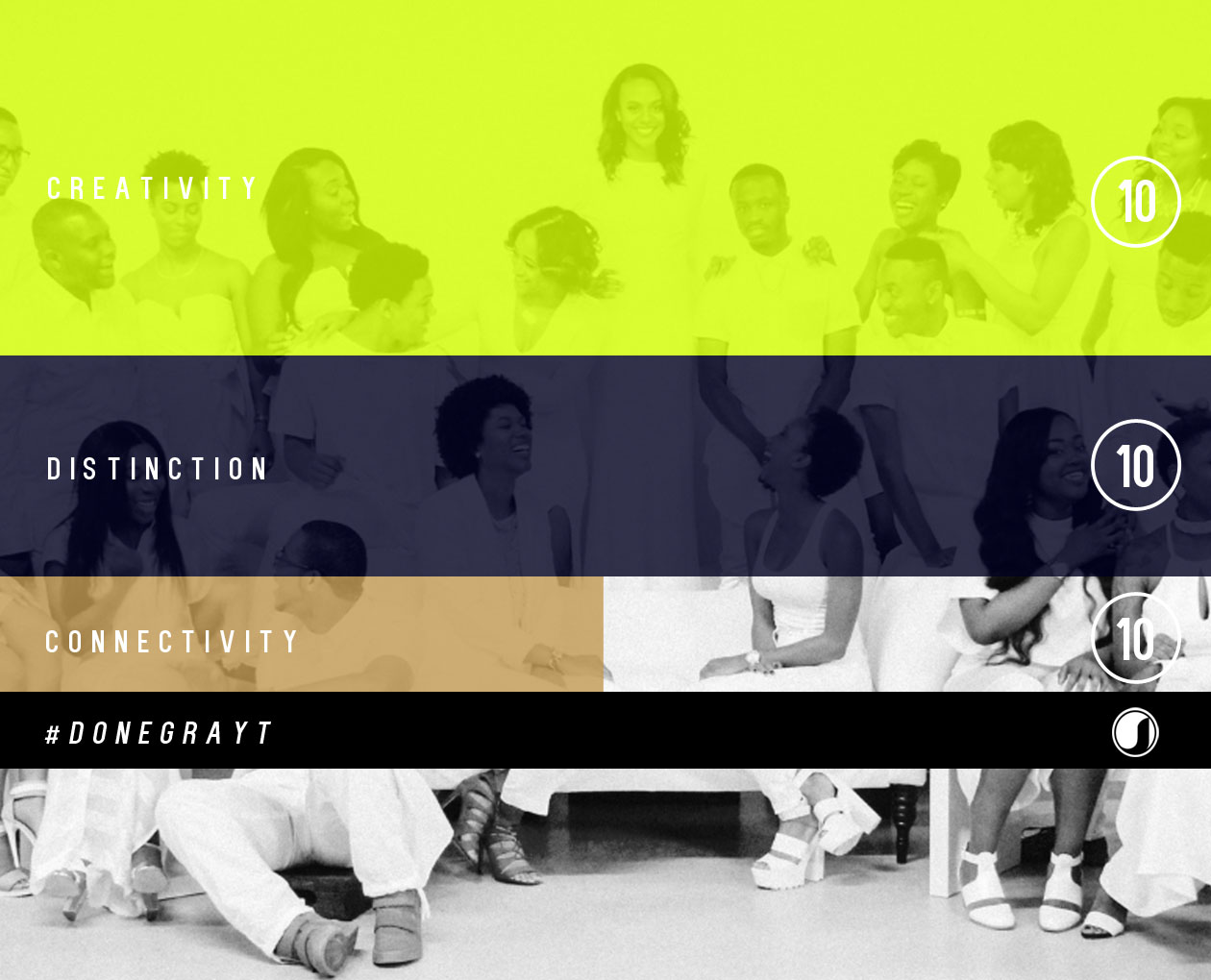
Connectivity, creativity, and distinction are all 10’s in my book (or, more specifically, on my site), but what do you think? Did you fight through the storm to attend any of Howard’s events? Let me know how you enjoyed the 2015 Bison Homecoming and share your thoughts in the comment section below!